TERRA & TIDE
LOGO + BRANDING
An organic visual identity rooted in clay and artistry
ABOUT THE PROJECT
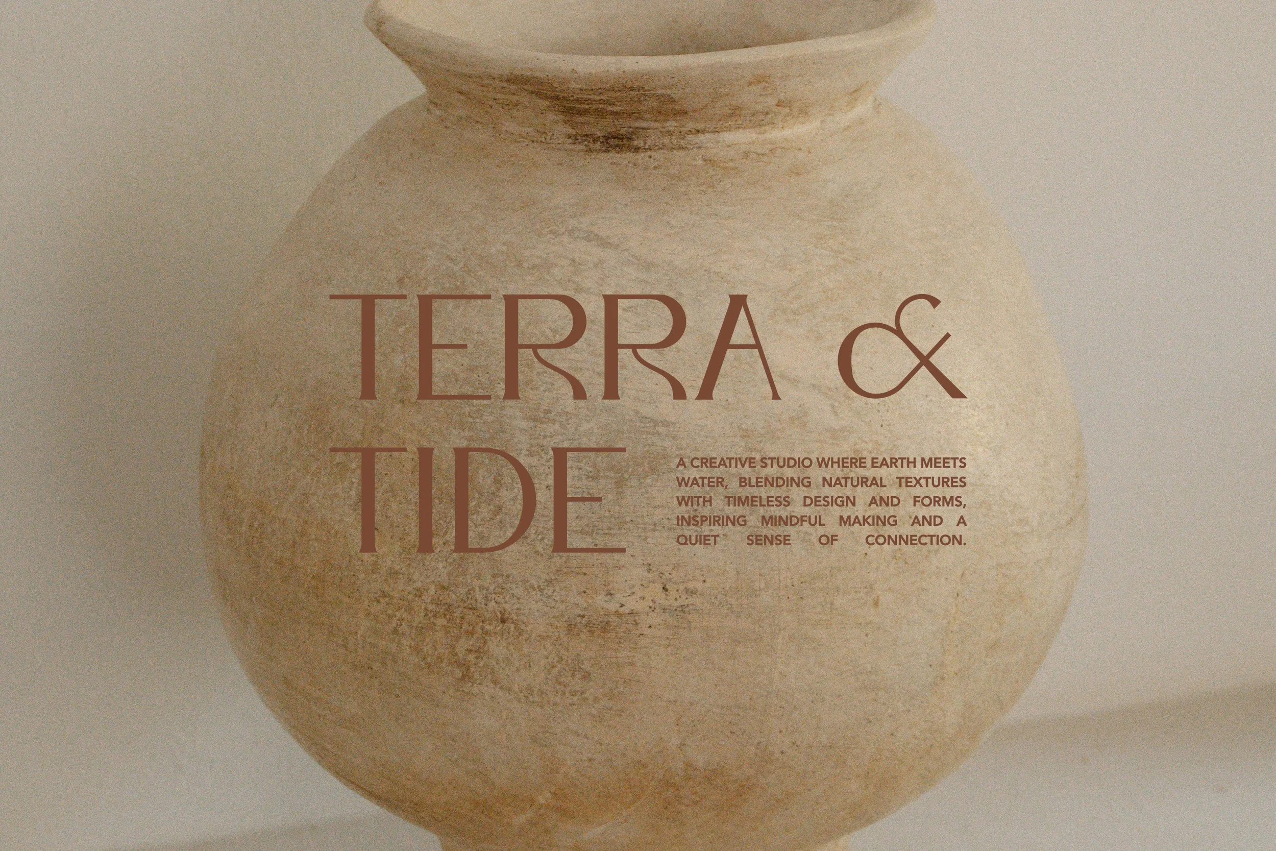
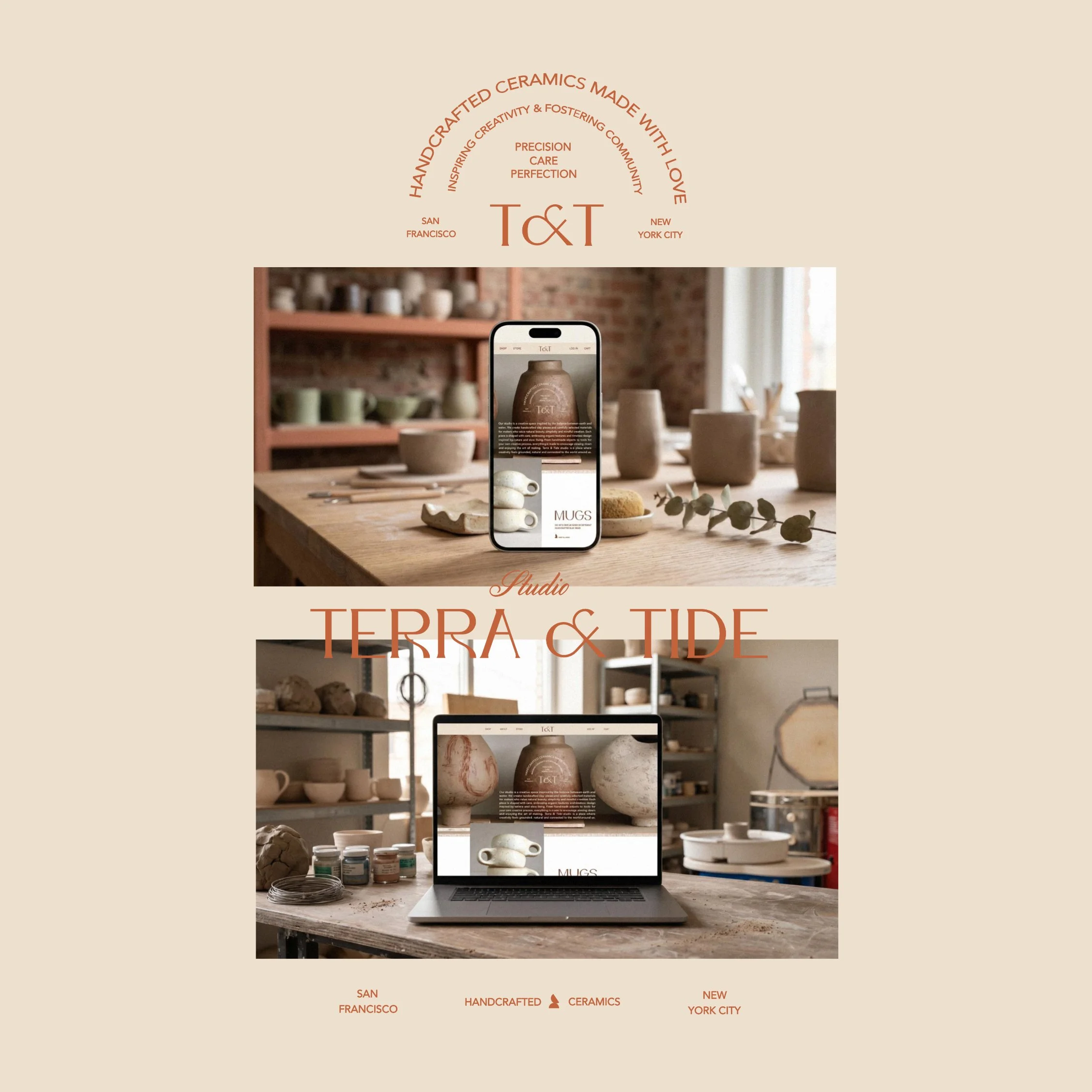
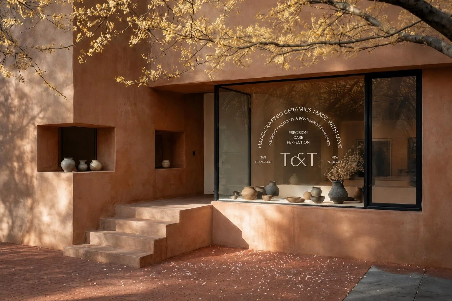
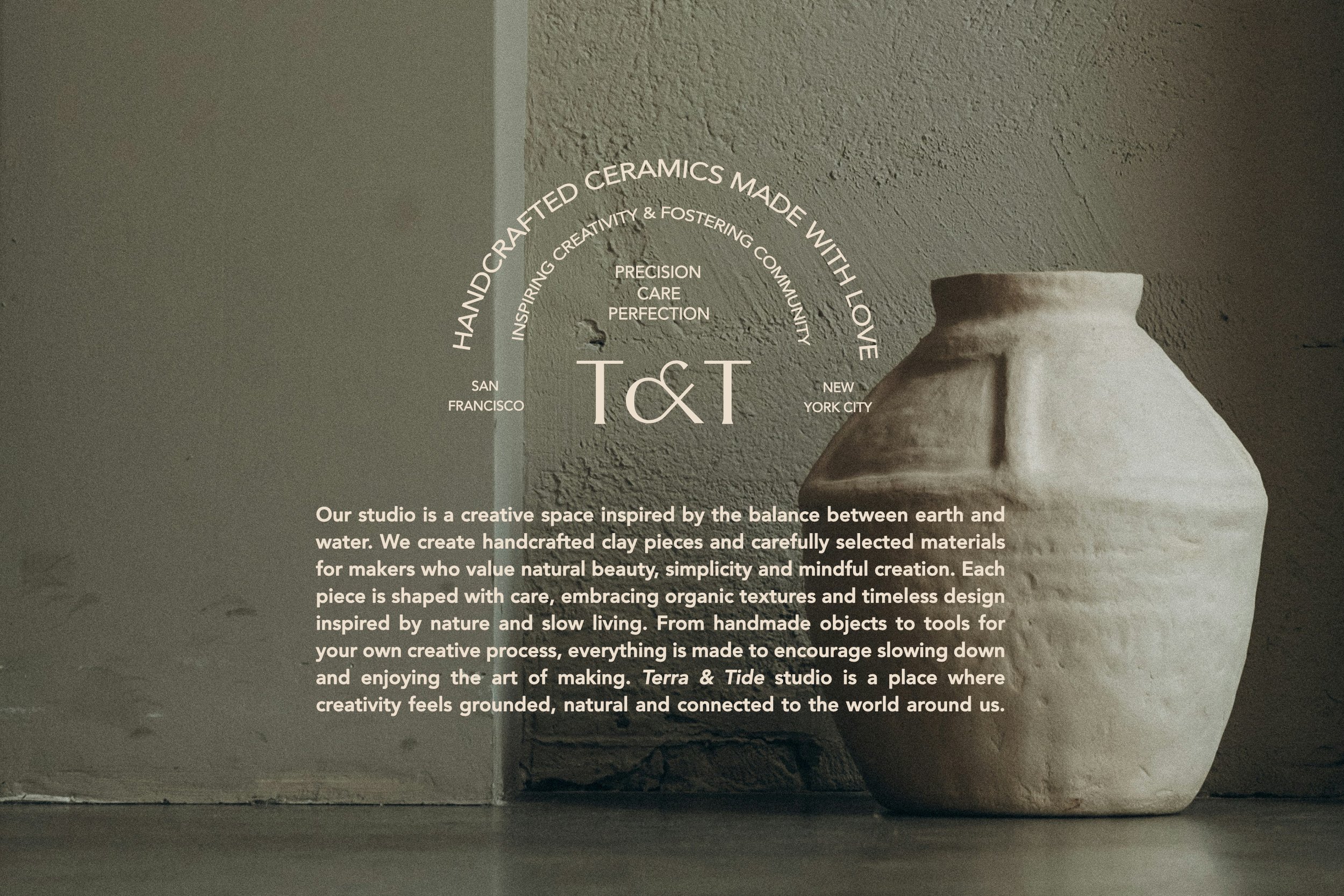
This project explores the visual identity of Terra & Tide Studio. A brand inspired by the balance between earth and water and the handmade nature of clay work. The aim was to create a clean, timeless identity that feels natural and contemporary, reflecting craftsmanship, simplicity and organic form.
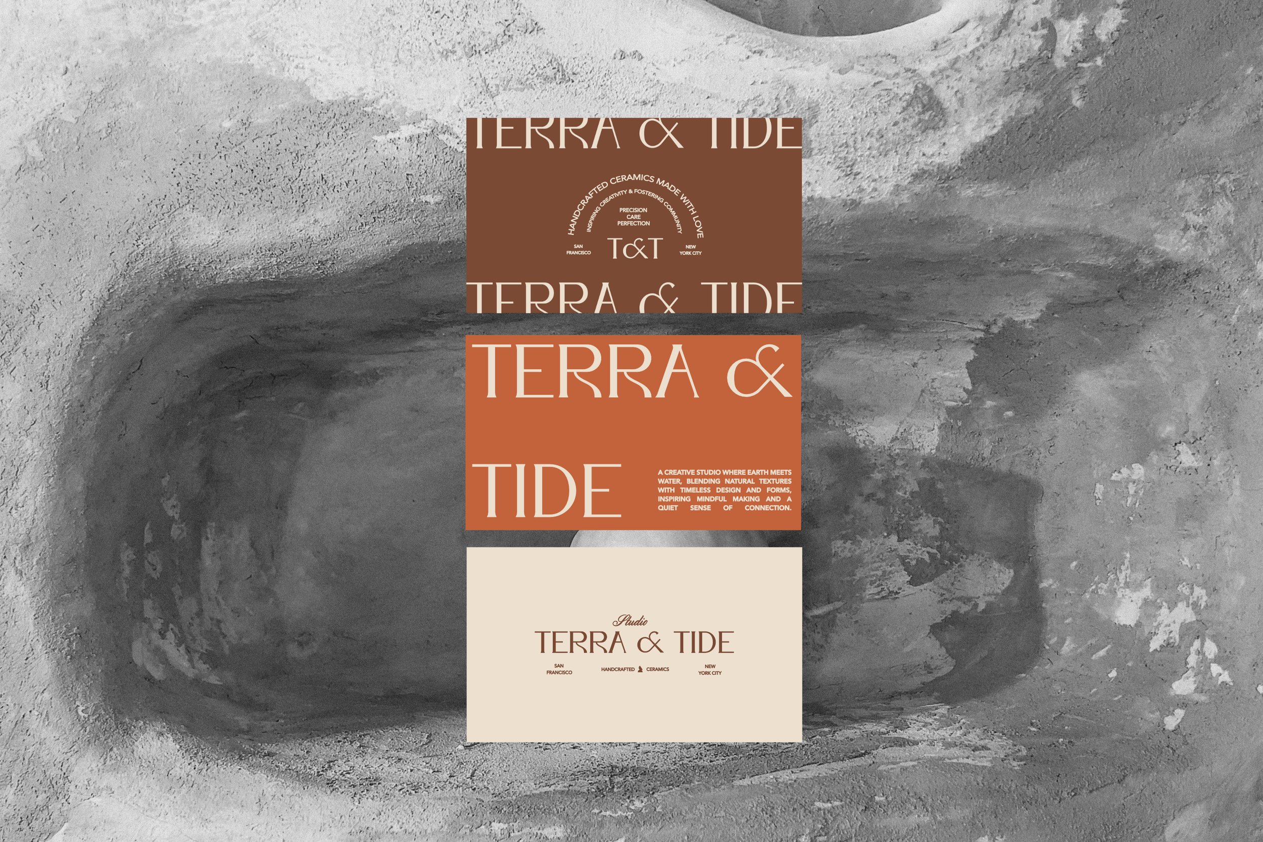
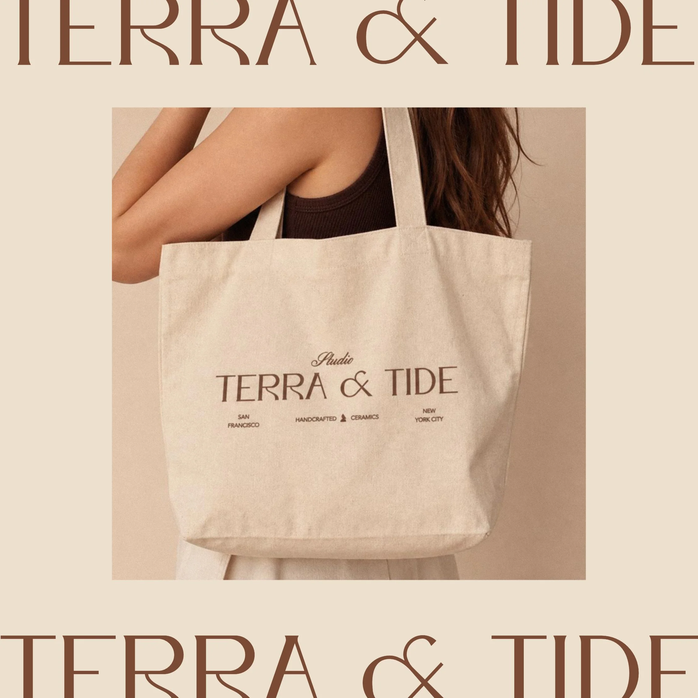
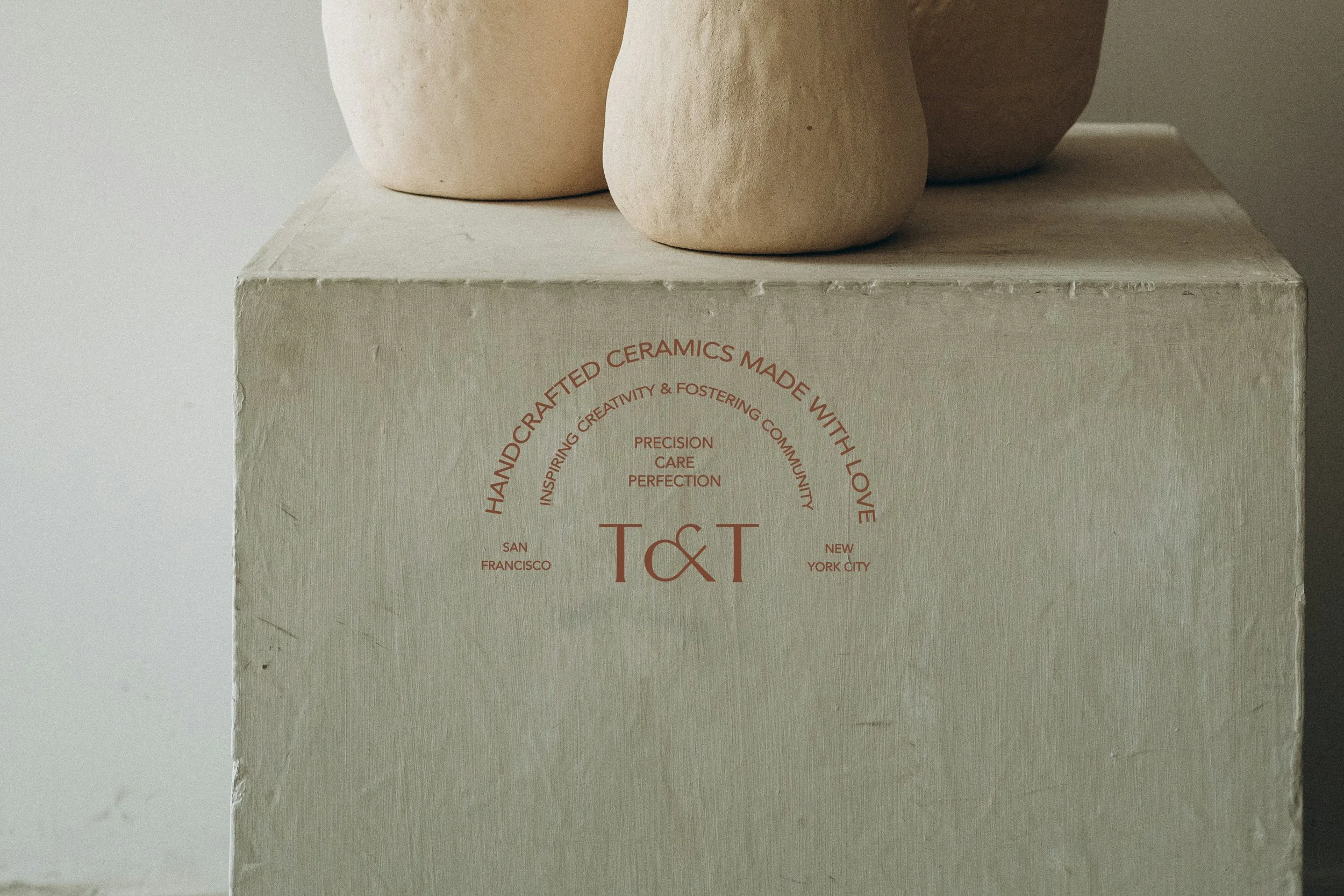
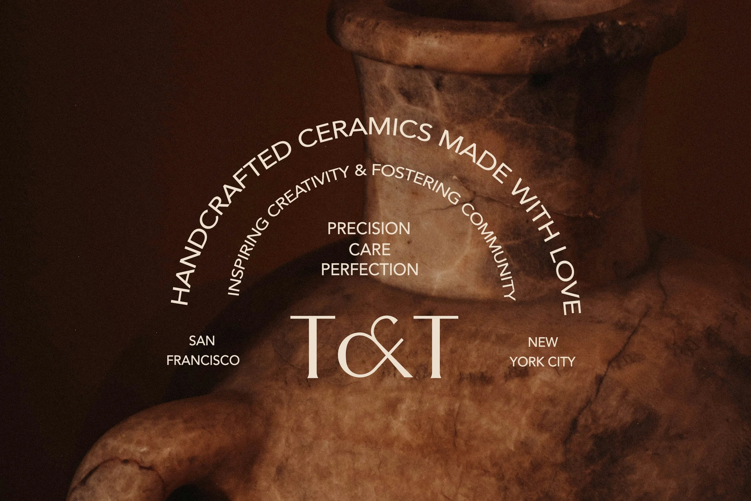
The logo is set in Bosch, chosen for its expressive and artistic character. Its subtle irregularities and handcrafted feel reflect the textures of clay, reinforcing the handmade essence of the brand.
For the tagline and supporting typography, Avenir was selected for its clarity and modern simplicity.
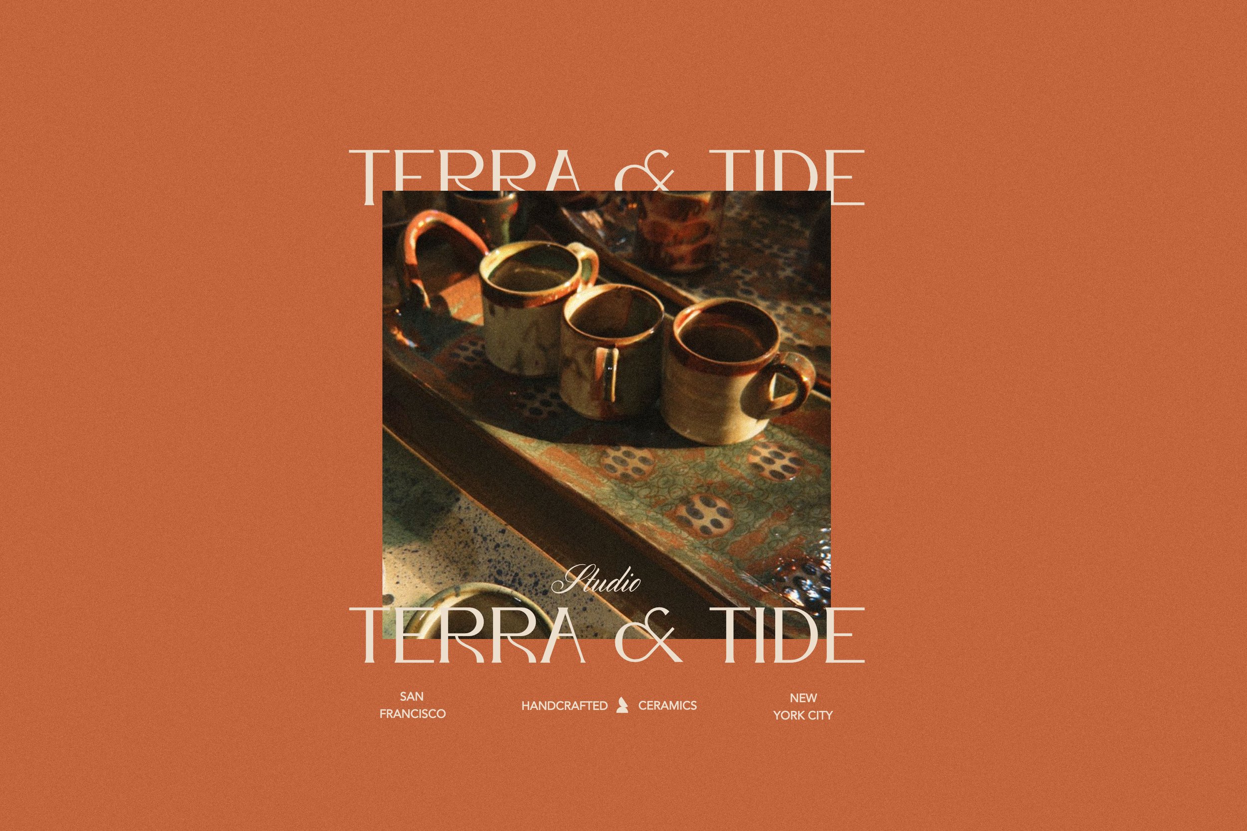
The color palette is inspired by clay and earthy materials, drawing from tones of soil, stone, sand and raw pigment. These muted hues reinforce the studio’s connection to nature and handmade processes, creating a calm and grounded visual identity.